From Chaos Emerges Order – When the Probability Distribution Sculpts Randomness
Khaled AuwadAbstract
The Galton board demonstrates how order emerges from chaos: thousands of balls falling randomly through pegs always form a bell curve. This article replicates the phenomenon using dice and Python simulations, tests whether introducing bias can alter the results. Finally, it reflects on how this principle—predictable patterns emerging from randomness— may or may not apply to other less obvious domains.
An initial version of this article was published on my LinkedIn. Link here
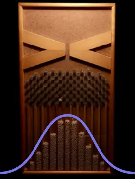
One of the toys I own as an adult (yes, I have a few!), is the Galton board. It is a board that looks like an hourglass but contains balls instead of sand and pegs arranged in several rows on the upper part. The lower part contains slots to collect the fallen balls. When you turn the board upside down, the balls begin to fall, and the role of the pegs is to direct them right or left to distribute them randomly into the collection slots. (Image 1).

The Galton board in action (© Wikipedia)
When a ball hits a slot, it can go left or right with equal probability. However, what is surprising about this board is that despite the random path of each ball, the final distribution of all the balls in the slots always forms a bell curve (Gaussian curve) as seen in the image below.
Reproducing the Results with Dice
You don't need a Galton board to see this phenomenon, you can use dice ⚀ ⚁ ⚂ ⚃ ⚄ ⚅.
Roll 10 dice simultaneously, then add up their values and note the sum. Repeat the rolls several times, and you will obtain a list of different sums. The smallest possible sum will be 1 × 10 = 10, and the largest will be 6 × 10 = 60. These two figures represent the extremes of probable sums which can be any number between 10 and 60. To visualize the frequency of sums, you can plot your results on a graph where the Y-axis represents the frequency of sums and the X-axis represents the values of the sums.
Here again, you will see that famous bell curve, despite the random nature of rolling dice.
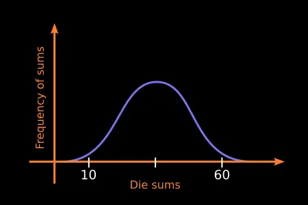
Distribution of dice sums.
Playing Without Dice?
With real dice, in order to observe the high frequency of certain sums compared to others, you need to perform a very large number of rolls, which can be very difficult and time consuming. Fortunately, we can simulate dice rolls with a computer. We can create virtual dice with Python by generating pseudo-random numbers between 1 and 6, and then use Matplotlib to create graphs representing the sums and their frequencies. (source code here).
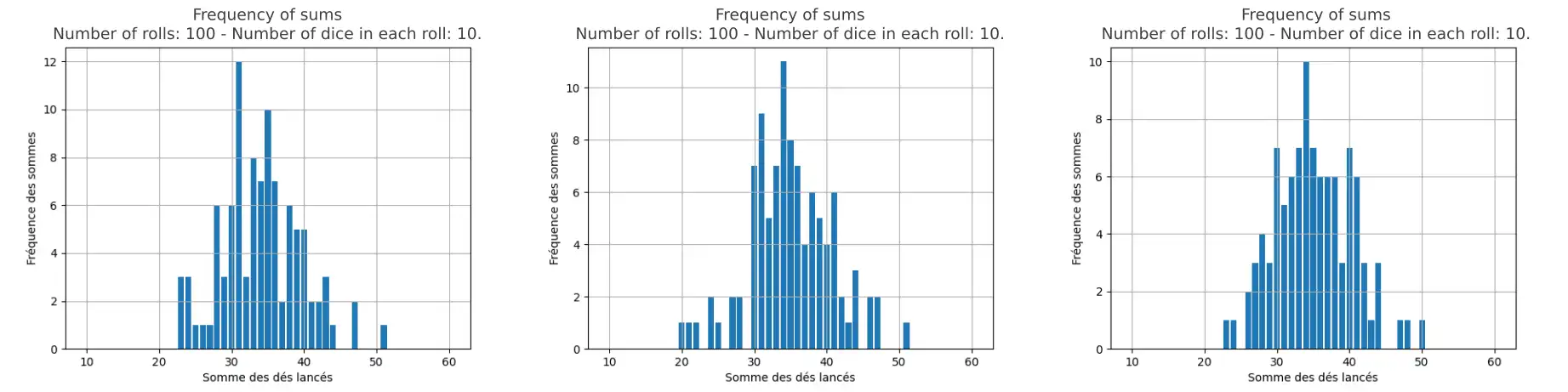
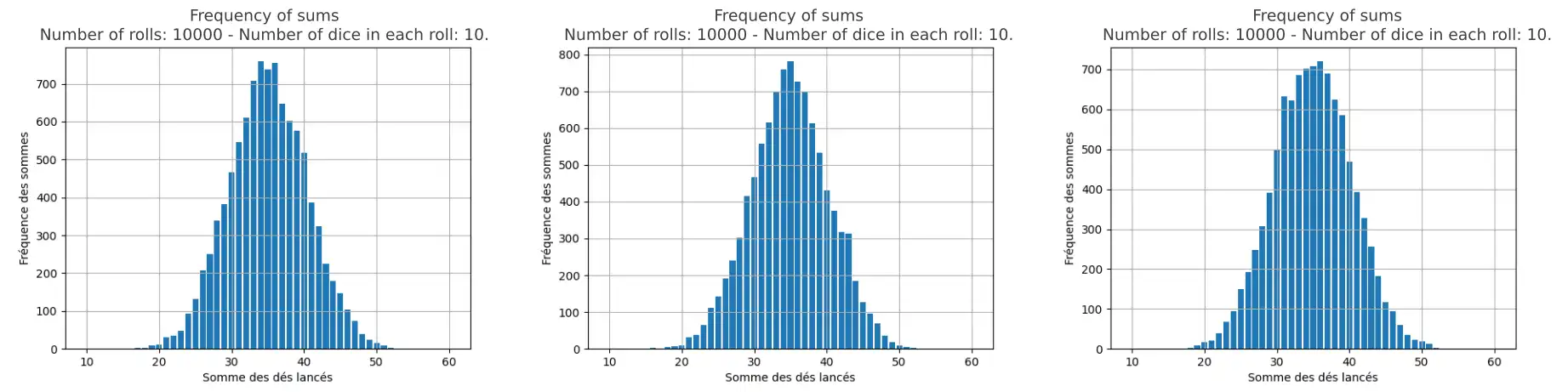
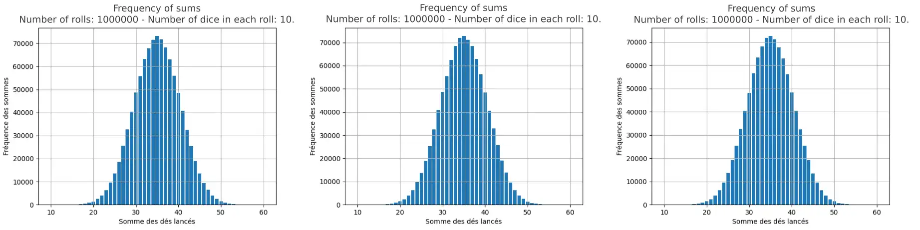
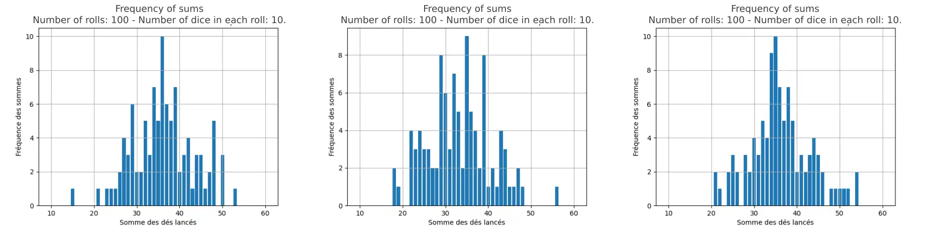
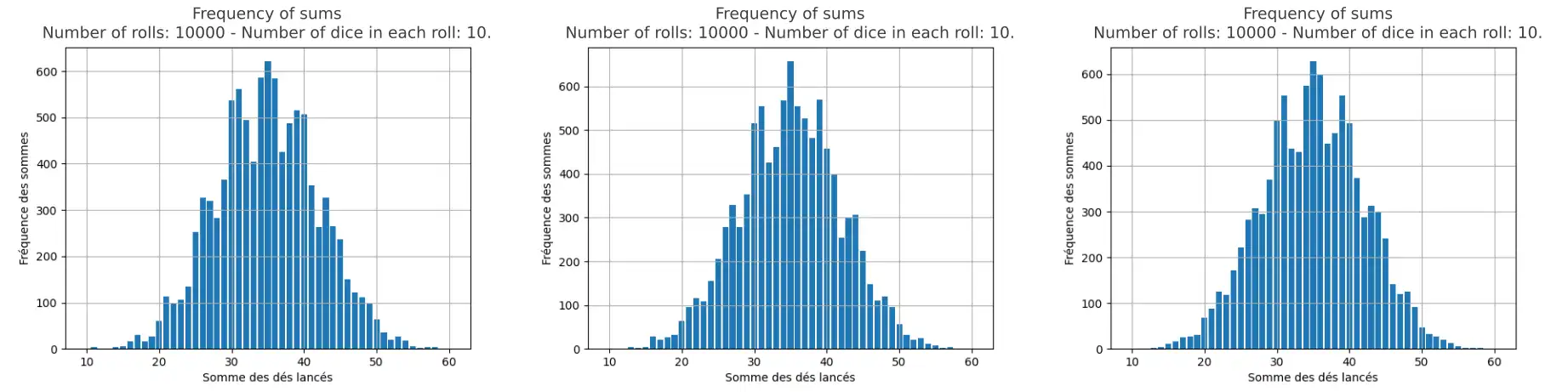
The code simulates rolls with a specified number of dice. You can adjust the number of dice rolled in each iteration as well as the total number of rolls by modifying the variables dice (number of dice) and rolls (number of rolls) in the code. We will perform three series of tests, each consisting of three rolls, then we will look at the generated graphs. All tests will be conducted with 10 dice, but we will vary the number of rolls in each series. The first series will consist of 10 dice and 100 rolls, the second series 10 dice and 10,000 rolls, and the third series 10 dice and 1,000,000 rolls. In total, we will obtain three series of graphs each illustrating the three results of each test. The horizontal axis in the graphs represents the different sums obtained, while the vertical axis indicates their frequency of appearance.
Three tests with 10 dice and 100 rolls
# parameters in the code
dice = 10
rolls = 100
Three tests with 10 dice and 10,000 rolls
# parameters in the code
dice = 10
rolls = 10000
Three tests with 10 dice and 1,000,000 rolls
# parameters in the code
dice = 10
rolls = 1000000
Result:
The bell-shaped curve reappears with dice and becomes more uniform as the number of rolls increases. Here again, despite the random nature of rolling dice, this does not prevent the emergence of an ordered system at large scale.
What if we introduced bias?
Up to this point, the parameters in the code are set so that each face of the die (numbers 1 to 6) has an equal probability of appearing which is 1/6.
In the Python code, the variable numbers represents the numbers on the die faces and the variable weights represents the probability of its appearance relative to the others.
numbers = [1, 2, 3, 4, 5, 6]
weights = [1, 1, 1, 1, 1, 1]
The value 1 in each position of the weights list assigned to each number on the die means they all have equal probability: 1/6. Let's change that.
Could we deform the curve if we introduced bias?
Now, we will modify the weights variable to give the sums that appeared less frequently higher weights and those that appeared more frequently lower weights:
weights = [100, 50, 1, 1, 50, 100]
This means that each die roll has 100 times more chance of producing a 1 or a 6 than producing a 3 or a 4, and 50 times more chance of producing a 2 or a 5 than producing a 3 or a 4.
The idea is to make the columns that represent the frequency of sums equal or close to 1 and 60 (the extremes) higher than the columns that represent the median sum 35 and its neighbors, so as to transform the curve from its shape from concave down to concave up.
We will repeat the 3 test series after introducing the biases.
Three tests with bias and 10 dice and 100 rolls
# parameters in the code
dice = 10
rolls = 100
Three tests with bias and 10 dice and 10,000 rolls
# parameters in the code
dice = 10
rolls = 10000
Three tests with bias and 10 dice and 1,000,000 rolls
# parameters in the code
dice = 10
rolls = 1000000
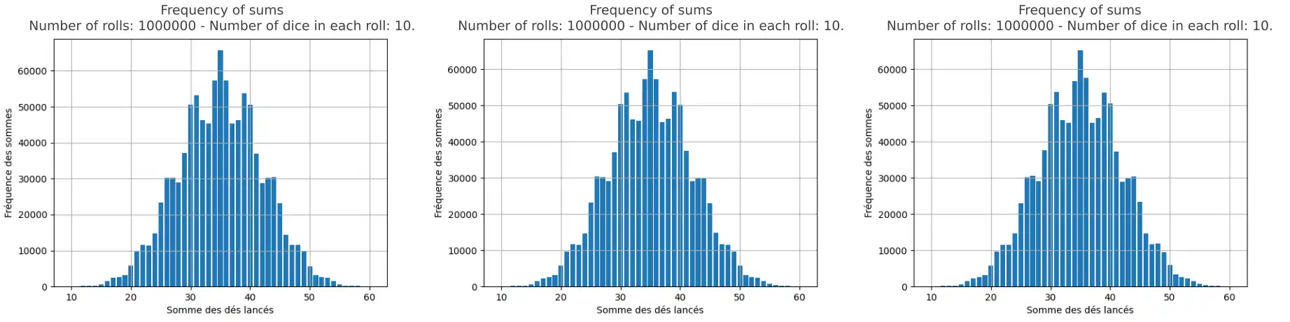
Well, failure! Despite the slight deformation, the curve always keeps its bell shape.
No magic in the math
Indeed, there is nothing magical about the Galton board or dice sums. The distribution of balls, which forms a bell curve, is merely an illustration of the law of large numbers and the normal distribution. A mathematician or statistician would probably not be surprised by these results. They would explain that Pascal's triangle explains the binomial distribution of paths through the board, which approximates the normal distribution for large numbers of rows, and that the probability distribution predicts the shape of the graph representing the frequency of dice sums, even when biases are introduced.
Pascal's triangle helps us understand why the balls fall this way. Each number in the triangle represents how many different paths a ball can take to reach a specific peg. The middle positions have the most paths leading to them, so more balls accumulate there. Conversely, the edges have far fewer paths, resulting in fewer balls. This mathematical pattern predicts exactly where the balls will land, transforming what seems like pure randomness into a predictable distribution.
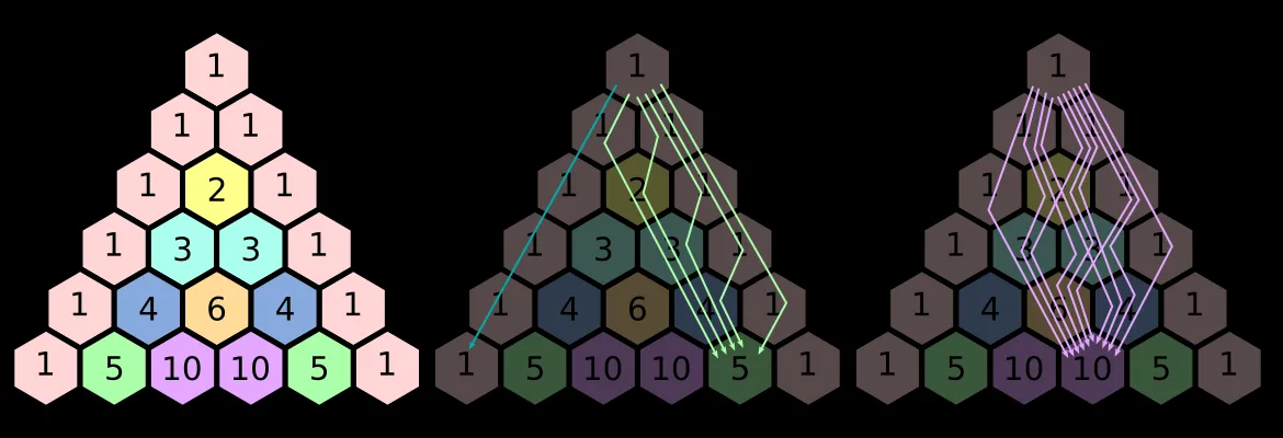
Pascal's triangle and the number of paths leading to positions at the bottom row.
Observations and Analogies
This phenomenon gives us pause to reflect on its potential impact on our lives.
It teaches us that chaotic events can become harmonious at large scale. Order can emerge from randomness and unpredictability. For example, the strange world of quantum mechanics, characterized by uncertainty, superposition, and entanglement, suggests that matter possesses an intrinsically chaotic nature. However, when observed at large scale (with our own eyes), it appears perfectly stable.
Similarly, this phenomenon prompts us to reflect on the cognitive biases present in our daily decisions and experiences. Sometimes, we introduce conscious or unconscious biases into our choices, but we don't know whether the laws of statistics manage to temper these biases. In other words, do these biases really have a significant impact on the overall trajectory of our life?